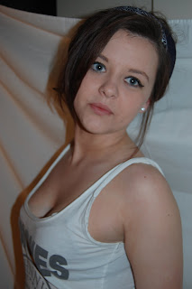
Initial Photography
These photo's were the originalss I had taken for my first draft of my magazine.
Rough Cut Feedback
Feedback was given from our teachers and peers to help improve our work.
Likes:
· Picture concept of beach
· Text styles
· Good use of editing
· Clear style model
· Continued colour theme
Dislikes:
· Some pictures needed to be sharper.
· Styling of some of the models
· More text on double page spread
How it could be improved:
· Perhaps incorporate more blue onto the contents page
· Retake the pictures and create more scenes like the beach instead of the plain white screen
· Make the barcode more realistic
· More quotes on the double page spread
· Perhaps use two fonts and colours for Q&A
· Put a price on the front page
· Lighting on pictures needs to be improved
New Pictures


No comments:
Post a Comment